Define an X-Axis for a Chart Widget
Use the X-Axis page (accessed from within the Chart Widget Properties window) to define how an x-axis looks and behaves in a Chart Widget. Properties include:
- Value Type: Date/Time, Number, Text, or Logical (True/False).
- Value Units (Date/Time value only): Days, Weeks, Months, Quarters, Years, Hours, Minutes, or Seconds.
- Label: Text to display on the x-axis.
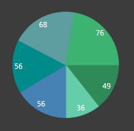
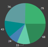
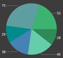
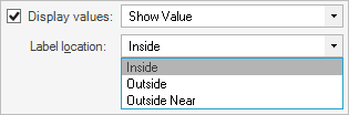
Doughnut and Pie Charts only:
- Label Location: Where to place the labels on a Doughnut/Pie Chart (ex: Inside the slice, Outside the slice with a line connector, Outside Near the slice aligned in columns with a line connector).
|
Date/Time and Number values only:
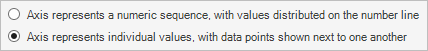
- Axis Represents:
Timeline or
Numeric Sequence, with values distributed over
time/number line: Distributes data points in order on a continuous timeline
or numeric sequence (ex: Earliest to latest date for Date/Time values and 1-100
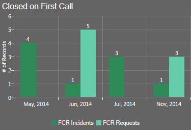
for Number values). For example, the following figures show Column, Line, and
Scatter Charts that plot on a timeline (May through November) the # of
Incidents and the # of Requests Resolved on First Call each month. Months with
no data points (ex: August through October) ARE included in the timeline
(x-axis).
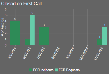
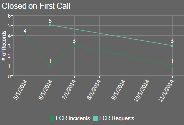
Timeline on Column Chart Timeline on Line Chart 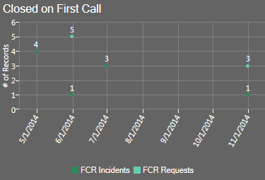
Timeline on Scatter Chart - Individual values, with data points next to
one another: Plots Individual data points next to one another with time or
numbers for reference. For example, the following figures show Column, Line,
and Scatter Charts that plot the # of Incidents and the # of Requests resolved
on First Call, with the month for reference. Note that months with no data (ex:
Aug through October) are NOT included in the x-axis. Also note that a line is
not drawn from one point to the next point in a series when there is a
"missing" x-value between the points (ex: When two or more series do not have
the same number of points, such as FCR Request not having a July data point).
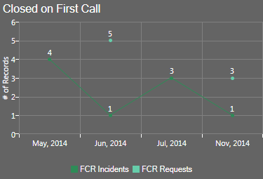
Individual Values on Column Chart Individual Values on Line Chart 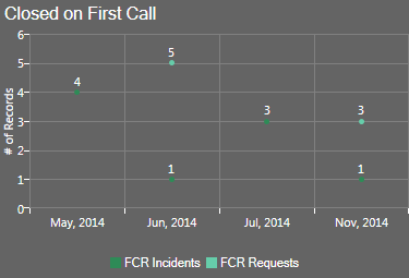
Individual Values on Scatter Chart Note: The Chart Series window is accessed from within the Widget Manager when you create or edit a Chart Widget, and then add a Series.
Good to know:
- You can have multiple data series in a chart but all series must be the same Value Type (ex: All Date/Time).
- The x-axis values themselves are defined as part of the series (see Define a Series for a Chart Widget).
- In Column, Line, and Scatter Charts, the x-axis is the horizontal axis. In Bar Charts, the x-axis is the vertical axis because the bars go across the chart.
- Forecasting formulas (ex: Trend Lines) are not available when individual values are plotted next to one another in a chart.
- Prior to CSM 4.6, all charts plotted individual values on the x-axis (timeline was not available).
To define an x-axis for a Chart Widget:
- Create a Widget.
- In the Type drop-down, select Chart.
- Click the x-axis
page.
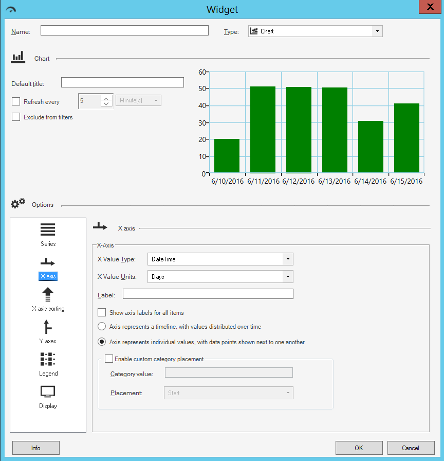
- Define the following properties:
- X-Value Type: Select the
type of data to display on the x-axis (you
can have multiple data series but all series must be the same type of data):
- DateTime
- Number
- Text
- Logical (True/False)
- X-Value Units (Date/Time value only): Select the date/time units (ticks) to display on the x-axis (ex: Days, Weeks, Months, Quarters, Years, Hours, Minutes, or Seconds).
- Label: Provide the
text
to display on the x-axis.
Tip: Typically, the x-axis is labeled with the name of the Field whose data it displays.
- Show Label for All Items: Select this check box to display a label for every tick on the x-axis. Otherwise, the chart only displays labels for some ticks to save space.
- Label Location (Doughnut/Pie Chart only): Select where to place
the labels on a Doughnut/Pie Chart (ex: Inside, Outside, Outside Near).
- Axis represents (Date/Time and Number values only): Select one
option:
- Timeline or Numeric Sequence, with values distributed over time: Select this radio button to distribute data points in order on a continuous timeline or numeric sequence (ex: Earliest to latest date for Date/Time values and 1-100 for Number values).
- Individual values, with data points
next to one another: Select this radio button to plot individual data
points next to one another with time or numbers for reference.
- Enable Custom Category Placement: Select this check box to enable
the placement of one axis value at either the start or end of the x-axis:
- Category Value: Provide the text of the axis label of the category that you want to match.
- Placement: In the drop-down, select where on the x-axis to
place the category value (either Start or End).
Note: Custom Category Placement can be enabled for all charts except pie, doughnut, and pipeline, and does not work for continuous numeric or date/time axes.
- X-Value Type: Select the
type of data to display on the x-axis (you
can have multiple data series but all series must be the same type of data):
-
Click OK.