Forms Theme Properties
In a Theme, define the following Form properties:
Note: In some instances where there is an option for more than
one color, the additional colors are used for a gradient.
- Accent Colors: Select the accent colors used to emphasize a color scheme.
- Alert Colors:
Select the alert colors to indicate an alert condition (high, low,
and medium).
Note: Accent and alert colors are not automatically applied to any elements. Manually apply the colors (or any colors for that matter), if needed. Often, these colors are used in Expressions to conditionally change the color.

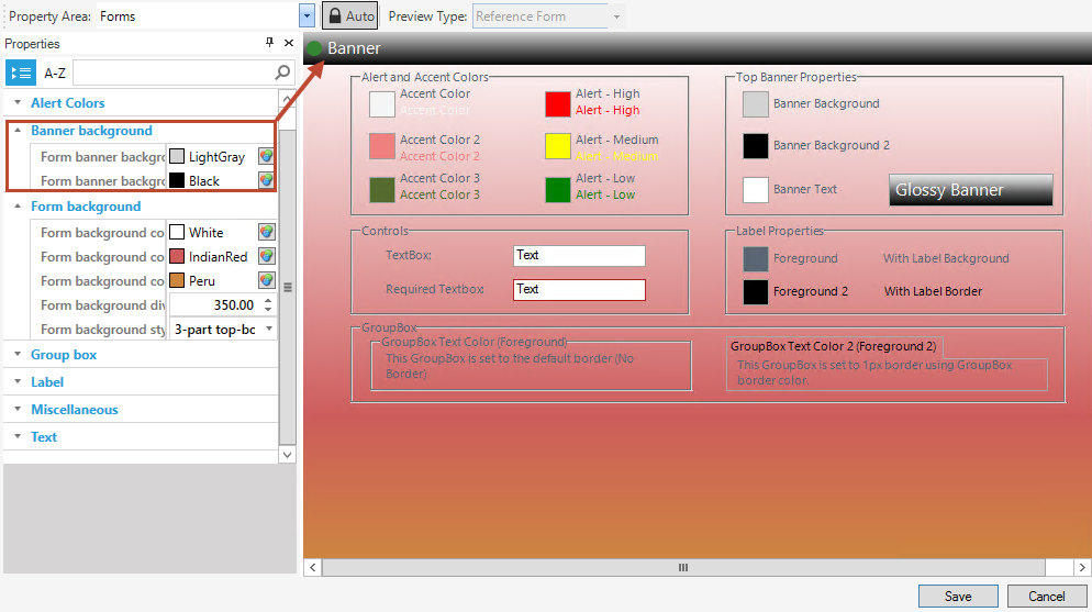
- Banner background: Select the banner
background colors. The two color options are available for a variety and to
support a gradient.
The figure shows a two-part gradient shading from the light gray to black on the banner and a three-part gradient on the form background shading from white to red to peru from top to bottom.
- Form background
- Form background color: Select the Form background colors.
- Background divide point: This is the place on the Form where the gradient colors begin on a three-point gradient. Scale is 0-999.
- Background style:
Select the style of background from None, Solid Color, Tiled
Image, or a gradient left-to-right, top-to-bottom, three part left-to-right, or
three part top-to-bottom.

- Group box: Select the group box background, border, and text colors (Group box color is applied by default. Manually apply Group box 2).
- Label:
Select the Label background, border, font, and text colors. In the
preview, the text color is shown as Foreground and Foreground 2. Foreground is
applied by default. Manually apply Foreground 2.
 n
n
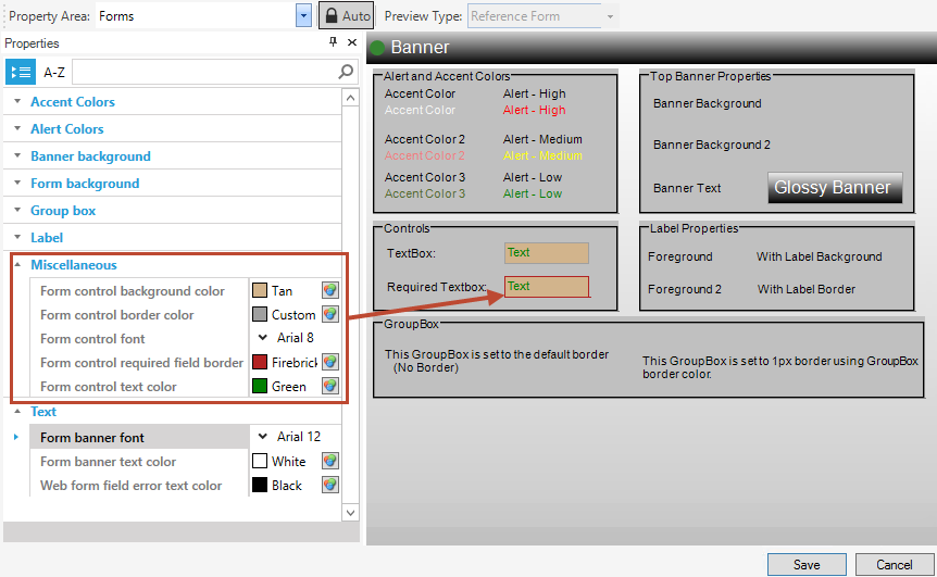
- Miscellaneous: Select form control colors
for the control background color, border color, font (type, size, and
attributes like bold, underline, italic, and strike out), required field
border, and text color.
Tip: Specify a font size that fits inside the box boundaries.
- Text: Select the banner font, banner text
color, and web form field error text color (not visible in the preview).

