Define General Properties for an Action Catalog Widget
Use the General page (accessed from within the Action Catalog Widget Properties window) to define the following general properties for an Action Catalog Widget:
- Image: To display inside the Widget bounding box. You can also add an image above the Widget (header area).
- Title: To display inside the Widget bounding box. You can also add a label above the Widget (header area).
- Description: To display below the title.
Note: The Action Catalog Properties window is accessed from within the Widget Manager when you create or edit an Action Catalog Widget.
To define general properties for an Action Catalog Widget:
Example: The following procedures demonstrate how to build an example Service Catalog. The example Service Catalog is named Service Catalog and displays a globe and a description.
- Create a Widget.
- In the Type drop-down, select Action Catalog.
- Click the
General page.
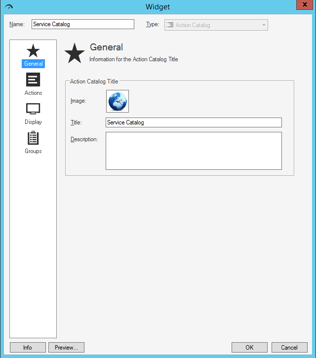
- Define general properties:
- Image button:
Click the Image button to open the Image Manager, and then select an existing image or import a new image to represent the item in the UI.
The image is shown inside the Widget bounding box, next to the Action Catalog's title (ex: A Globe). - Title:
Provide a title to display at the top of the Widget inside the Widget bounding box. The font, style, and color are inherited from the Action Catalog's style (defined on the Display page).
- Description:
Provide a description to use within CSM (this property can be searched in CSM Item Managers).
- Image button:
-
Click OK.