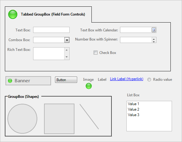
| Field Controls
|

|
Text Box
|
Rectangular frame into which you can type text. This can be a
single-line Text Box or a multi-line Text Box (Field property determines the
number of lines).
Use for:
 Text fields Text fields
 Number fields Number fields
|
|
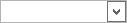
Combo Box
|
Rectangular frame into which you can either type a value or
select a validated value from a list.
Note: If validation is enforced on
the Field, you can only enter
valid values into the Control.
Use for validated:
Text fields
Number fields
|
|
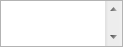
Rich Text Box
|
Rectangular frame into which you can type/paste
Rich Text
(formatted text and/or images). This Control allows access to formatting
options using the Rich Text Zoom window (F8).
Use for Rich Text:
Text fields
|
|
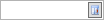
Text Box with Calendar
|
Rectangular frame with a popup calendar, into which you can
type a date or select a date from the calendar popup window.
Use for:
 Date/Time fields Date/Time fields
|

|
Number Box with
Spinner
|
Rectangular frame into which you can either type a number or
select an incremental number from a list.
Use for:
Number fields
|

|
Check Box
|
Square box that is selected (checked) or cleared (unchecked)
to indicate a logical decision (example: Enabled/disabled, on/off, yes/no).
Use for:
 Logical fields Logical fields
|
| Standard Controls
|

|
Banner
|
Title and image (example: Company name and
logo).
|

|
Button
|
Button that is capable of executing a single
Action when clicked (example: Run an Action).
|


|
Group Box/Tabbed Group
Box
|
"Container" shape around other Controls. Used
to organize other Controls and enhance the appearance/usability of the Form.
|

|
Image
|
Custom image. Use to enhance the
appearance/usability of the Form.
|

|
Label
|
Text that identifies or enhances other Form
elements (example: The Form itself, area, Control, group of Controls, etc).
Often, a label is
tied
to and identifies a Field Control.
|

|
Link Label
|
Underlined text that is capable of executing a
single Action when clicked (example: Run an Action).
|

|
List Box
|
Rectangular box with multiple values.
|

|
Radio Button
|
List of choices; stores a value for the
selection.
|


|
Shape
|
Various shapes (Ellipses, Lines, and
Rectangles) that organize other Controls and enhance the appearance/usability
of the Form.
|
| Special Controls
|

|
Embedded Form
|
Special Control that provides a "container"
frame for one or more
Embedded Forms. The
Control's properties define when and how the Embedded Forms are displayed.
|
|
|
Matrix Selector
|
Special Control that displays a configurable
matrix.
|
|


|
Related Item
Picker
|
Special Control that allows you to quickly access related
information in order to view or populate a Field with a value. In
CSM, you can access the following related information:
- Customer (example: Contact Manager
 and Customer Record and Customer Record
 ) )
- CMDB (example: CI database
 and CI Record
) and CI Record
)
- Configurable List of values (example: Incident
Categorization)
|