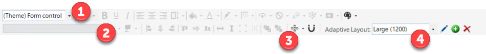
Form Editor Toolbar
Use the Form Editor toolbar to quickly access common commands for formatting the appearance and behaviors of a Form and its Form Controls. The toolbar is made up of three smaller toolbars:
- Formatting toolbar
Displays options for formatting Form Control text/label (font, style, size, and alignment), colors/styles (foreground, background, and border), and behaviors (visibility, anchoring, and image). Also displays options for accessing a Form background color.
- Label toolbar
Displays options for defining Form Control labels and wrapping.
- Design toolbar
Displays options for aligning and placing Form Controls.
- Adaptive Layouts toolbar
Displays options for managing a Form's Adaptive Layouts.
Good to know:
- Move a toolbar by double-clicking the Grab bar
 , or by grabbing the Grab bar and then dragging the
toolbar to a new location.
, or by grabbing the Grab bar and then dragging the
toolbar to a new location.
- Re-dock a toolbar to its default location by double-clicking the header banner of an undocked toolbar.
- Hide a toolbar by right-clicking anywhere in the toolbar area, and then unchecking the toolbar.
- Many of the toolbar options are also available from the Form Editor context (right-click) menu.
Formatting Toolbars (Text, Color/Style, and Behaviors)
Form Control Text/Label
| Button | Action | Description |
|---|---|---|
|
Form Control text |
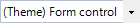
There are two different font modes for Form Control text:
To switch to Theme mode, select Theme Font from the top of the list. To switch to Explicit mode, select a font in the drop-down. |

|
Font size |
Explicitly sets the Form Control font size (ex: 10 points). Note: This option is available only when using Explicit Font
mode.
|

|
Font style |
Adds style to the Form Control font (bold, underlined, or italics). Note: This option is available only when using Explicit Font
mode.
|

|
Horizontally align text | Aligns text left, center, or right on a horizontal axis within the Form Control bounding box. |

|
Vertically align text | Aligns text top, middle, or bottom on a
vertical axis within the Form Control bounding box.
Click the drop-down arrow to select the alignment option. |
Control Color/Style
| Button | Action | Description |
|---|---|---|

|
Background color |
Click the button to use the most recently used color (assuming you have set a color). To explicitly select a color, click the drop-down arrow to select a solid color or a gradient. You can use an Expression to conditionally change the color. |

|
Text color |
Click the button to use the most recently used color (assuming you have set a color). To explicitly select a color, click the drop-down arrow to select a single color or a gradient. You can use an Expression to conditionally change the color. |

|
Border color |
Click the button to use the most recently used color (assuming you have set a color). To explicitly select a color, click the drop-down arrow to select a single color or a gradient. You can use an Expression to conditionally change the color. |

|
Border style |
Sets the style of the border around the Form Control (No Border, 3D, or Pixel width), if there is a border. Click the button to use the most recently set style (assuming you have set a style). To explicitly select a style, click the drop-down arrow to select a style. Note: While you can select 3D borders for any Form Control,
rounded Shapes do not allow 3D settings.
|
Control Behavior
| Button | Action | Description |
|---|---|---|

|
Visibility |
Conditionally controls when the Form Control appears and disappears. The visibility is based on an Expression. Click the drop-down button to define a custom Expression. Click the drop-down arrow to access options for creating a custom Expression, selecting a stored Expression, or clearing the Expression. |

|
Visibility by Expression |
Conditionally controls when the Form Control is available. The visibility is based on an Expression. Click the drop-down button to define a custom Expression. Click the drop-down arrow to access options for creating a custom Expression, selecting a stored Expression, or clearing the Expression. |
|
Localization options |
Enables you to:
This option is only available when Globalization is enabled. |

|
Control anchor |
Sets the anchoring behavior of the Form Control. Click the button to use the most recently set anchoring options (assuming you have set an option). To explicitly select an anchoring option, click the drop-down arrow next to the button to open the Anchoring window, and then select an anchoring option. |

|
Control image |
Defines the image to display on the Form Control, as well as alignment. Click the button to open the Image Manager, and then select an image to show on the Form Control. Click the drop-down arrow to access options for creating a custom Expression, selecting a stored Expression, clearing the Expression, or aligning the image. |
Form Background Color
| Button | Action | Description |
|---|---|---|

|
Form background |
Sets the Form background color. Click the button to use the most recently set color (assuming you have set a color). To explicitly select a color, click the drop-down arrow to select a single color or a gradient. Use an Expression to conditionally change the color. |
Label Toolbar (Label Text, Wrap, Style, and Gloss)
| Button | Action | Description |
|---|---|---|

|
Label Text Box |
Defines the text/label that appears on the currently selected Form Control. Type the text into the Label text box. Note: This value only affects the primary selected Form
Control.
|

|
Expression |
Conditionally defines the text that appears on the currently selected Form Control. You can use either:
|

|
Tooltip | Defines the tooltip that appears when a User hovers over the Form Control. |
Design Toolbar (Alignment, Size, and Order)
For most of the alignment operations, you must select at least two Form Controls. The last selected Control is the controlling Control, and the Control against which all other selected Controls are sized and aligned. The controlling Control is identified by black boxes. All other selected Controls are identified by white boxes.
| Button | Action | Description |
|---|---|---|

|
Line up horizontally | Lines up all the selected Form Controls against the left, center, or right edge of the controlling Form Control. |

|
Line up vertically | Lines up all the selected Form Controls against the top, middle, or bottom edge of the controlling Form Control. |


|
Sizing | Sizes all the selected Form Controls to be the same width, the same height, or both the same height and same width as the controlling Form Control. |

|
Auto-size | Sizes a text Form Control to be exactly the right size to hold all its contained text. Sizes an image to be its original size. |

|
Bring to Front |
Moves a Form Control in front of other Form Controls. Use this if creating various layering effects. Note: Not all Form Controls are allowed to be in front or
behind all other Form Controls (ex: Most shapes cannot be on top of most
fields).
|

|
Send to Back |
Moves a Form Control behind other Form Controls. Use this if you are creating various layering effects. Note: Not all Form Controls are allowed to be in front of or
behind all other Controls (ex: Most Shapes cannot be on top of most Fields).
|
|
Activates Guide Lines | Grid Guide Lines of customizable widths appear to assist with Form creation. Widgets or Fields automatically align to the width of the guide lines. |
|
Activates Guide Snapping | Guide Snapping connects Widgets and Fields to the primary component. Enabling Guide Snapping assists with creating Forms by making it easier to move multiple components at once while keeping their spacing or alignment. A red guide line also appears to assist with horizontal and vertical alignment. |
Adaptive Layouts Toolbar
| Button | Action | Description |
|---|---|---|
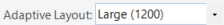
|
Select an Adaptive Layout | Activates the selected Adaptive Layout in the Form Editor so that you can change its design, edit its properties, or delete it. |
|
Edit an Adaptive Layout | Allows you to edit the properties of the selected Adaptive Layout. Refer to Edit an Adaptive Layout for details. |
|
Create an Adaptive Layout | Allows you to create a new Adaptive Layout for the Form. Refer to Create an Adaptive Layout for details. |
|
Delete an Adaptive Layout | Allows you to delete the selected Adaptive Layout. Refer to Delete an Adaptive Layout for details. |